CASE STUDY · REDESIGN
TL;DR
I know you’re busy. Here’s the entire project in 30 seconds.
01
PROBLEM — A large portion of HGTV Canada’s traffic arrived from Google Search, for a specific show like Property Brothers, or a practical query like “How to build a deck”. However, they got their answer, they bounced. With an ad-supported model, that one-and-done pattern capped both discovery and revenue. Our article and show pages weren’t surfacing related content, and our navigation barely exposed the categories that already existed, so there was no natural next step keeping people in the HGTV ecosystem.
02
MY ROLE — As Product Designer, I led this project largely on my own, working with a researcher (Patrick) to pull Hotjar behavioural data, then owning the redesign end-to-end and partnering with developers to ship it.
03
SOLUTION + CONVERSION — I expanded the navigation to surface the site’s existing categories, which had been buried, and introduced related-content modules on article and show pages so readers had a relevant next click instead of a dead end. The result was a measurable increase in time on site, directly supporting ad revenue — our primary conversion metric.
ROLE
Product Designer
BRAND
HGTV Canada
Team
Design, Research, Project Manager, Developers
Medium
Desktop + Mobile


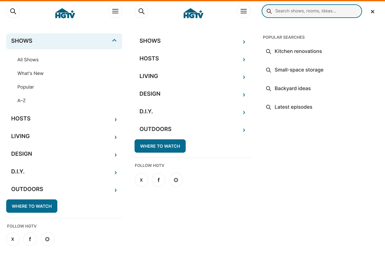
Since a large portion of Google Search traffic landed on mobile, the navigation and content updates needed to hold up just as well on a small screen as they did on desktop. The underlying fixes were the same: surfaced categories, related-content modules, translated into a mobile-friendly structure so the experience stayed consistent no matter how someone arrived at the site.
Better navigation solved the “I didn’t know this existed” problem, but it only helped people who went looking. Someone who landed directly on an article or show page from Google still needed a reason to go further without leaving the page they came for. So I introduced related-content modules directly within articles and show pages — connecting a DIY post to adjacent topics, or a show page to related shows, hosts, and personalities — so the next step was already in front of them at the exact moment they were deciding whether to stay or leave.
03 · TAG PAGES
Expanding the navigation only mattered if clicking into a category actually led somewhere useful. Each nav item mapped to a tag page pulled directly from WordPress’s existing tagging structure, so when someone clicked “DIY” or a specific show category, they landed on a page that filtered and organized everything tagged under it. These pages were the connective tissue between the navigation and the content itself: the nav told people what existed, and the category pages delivered on that promise by giving them a real, organized destination instead of a generic archive dump.

04 · ARTICLE DISCOVERY
The related-content modules pulled from existing tags rather than manual curation, so the system scaled with HGTV Canada’s full content library instead of requiring ongoing editorial upkeep. That mattered given how disorganized the underlying tagging had been, the fix needed to work with the CMS as it existed, not assume a cleanup effort that wasn’t scoped into this project.

05 · ARTICLE RESPONSIVE DESIGN
Article pages needed the same related-content logic on mobile, but the constraints were different. Related-content modules that worked as a sidebar or inline block on desktop had to be rethought as compact, stacked components that didn’t interrupt someone mid-read on a smaller screen. Navigation followed the same principle — the expanded categories from desktop collapsed into a structure that stayed scannable without needing a full menu open to browse.
06 · SHOW EXPERIENCE
Show pages as a destination, not a dead end.

07 · DESIGN SYSTEM
A component language for editorial and monetization needs
The work extended beyond any single article or show page. I designed a reusable component system including: navigation states, article and show page templates, and the related-content modules themselves. Editors could apply consistent patterns across the site without a formal design system in place. A few pieces mattered most: the related-content module, since it powered the core discovery fix; a standardized article template, since it kept every DIY post equally easy to scan and navigate; and shared navigation states, since they made the expanded categories behave consistently no matter where someone entered the site.

08 · CONSTRAINTS
Improve discovery within what Canadian viewers could actually access
I also explored bringing more video and full episodes forward as a way to deepen engagement, but Canadian–US licensing constraints meant that content couldn’t be made freely available on the Canadian site. With that option off the table, the most immediate lever left was discoverability — making the Canadian content that already existed far easier to find. That’s what shaped the direction toward navigation and related-content work rather than expanding the content library itself.
09 · OUTCOMES
More time spent on the site
While I no longer have access to the original analytics to cite an exact figure, the redesign produced a meaningful increase in time on site from memory, in the range of a 15% lift and a few additional minutes per session , which supported the ad revenue this site depended on. The clearer signal was qualitative: fewer one-and-done visits, and a navigation and content structure that gave people an obvious next step instead of a dead end.